
 By
By 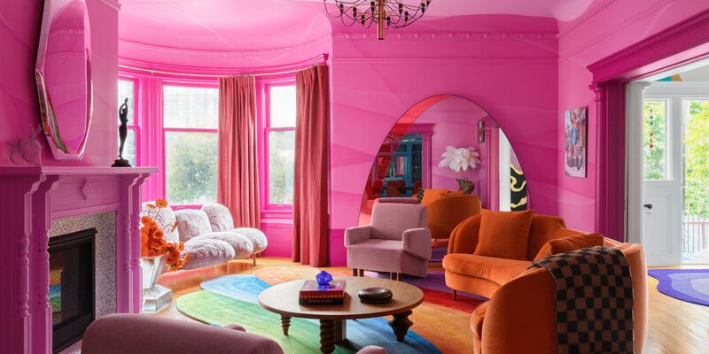
Color is the silent director of residential interior design. Long before a guest notices the grain of your hardwood floors or the fabric of your sofa, their nervous system registers the color palette of the room. Chromatic choices govern emotional resonance, dictating whether a space feels like a vibrant social hub or a serene personal sanctuary. Selecting the right color palette is not merely about matching throw pillows to wall paint; it is about harnessing environmental psychology to curate an atmosphere that supports your daily mental state and lifestyle.
Translating abstract moods into cohesive physical spaces requires understanding how hues interact with natural light, architectural scale, and texture. By deliberately aligning your decor choices with the psychological impact of specific colors, you can transform your home into an adaptive environment that mirrors and elevates your desired emotional states.
The Psychology of Color in Living Spaces
Color perception is deeply rooted in evolutionary biology and cultural conditioning. Warm hues like reds, oranges, and yellows mimic fire and sunlight, stimulating energy, appetite, and conversation. These tones work exceptionally well in active communal areas like kitchens and dining rooms where social interaction takes center stage. Conversely, cool hues like blues, greens, and soft lavenders mirror sky and foliage, signaling the brain to lower heart rates and unwind.
Understanding these baseline psychological responses allows you to design room-by-room palettes tailored to function. A home office requires colors that foster focus without inducing anxiety, while a bedroom demands shades that promote restorative rest.
Crafting a Serene and Restful Sanctuary
When the goal is tranquility and stress reduction, the color palette must step back and soothe the senses. Overstimulating brights and stark contrasts have no place in a restful retreat.
-
Muted Earth Tones: Shades like warm sand, soft clay, and pale taupe ground a room, connecting the interior to the calming simplicity of the natural world.
-
Low-Saturation Greens: Sage, olive, and eucalyptus green evoke living foliage, offering restorative visual relief for eyes fatigued by screens and urban environments.
-
Whisper-Soft Blues: Pale sky blue and slate gray introduce a breezy, weightless quality that encourages deep breathing and mental clarity.
To prevent serene spaces from feeling sterile or flat, layer various textures within the same tonal family. Combine a soft oatmeal linen duvet with a chunky boucle throw blanket and bleached oak furniture. This monochromatic textural play adds rich tactile depth without introducing visual chaos.
Energizing and Uplifting Social Zones
Spaces designated for gathering, cooking, and entertaining benefit from dynamic color choices that spark vitality and keep energy levels elevated.
-
Sun-Kissed Yellows: Soft buttercup or warm mustard introduces a cheerful ambiance, reflecting natural light and making north-facing rooms feel instantly warmer.
-
Terracotta and Rust: These rich, earthy warm tones stimulate appetite and encourage warm conversation, making them ideal for dining rooms and kitchen accents.
-
Deep Jewel Tones: Emerald green, sapphire blue, and rich plum add dramatic flair and sophisticated energy when applied in well-lit living spaces.
Balancing high-energy colors prevents them from becoming overwhelming. Pair bold wall colors with neutral flooring, natural wood tones, and metallic accents in brass or black to anchor the space.
Establishing Focus and Productivity in Home Offices
Designing a workspace requires a careful chromatic balance. Too much warmth can induce restlessness, while too much monotony can lead to fatigue and lack of motivation.
The most effective home office palettes rely on balanced neutrals paired with grounding accents. Crisp off-whites and warm grays create a clean backdrop that minimizes visual distractions. Introduce subtle focal points using deep charcoal or focused navy blue on an accent wall behind the desk. This creates a sense of boundary and concentration while providing a sharp, professional background for video calls.
The 60-30-10 Rule of Chromatic Balance
Even the most carefully curated mood board can fail if color proportions are unbalanced. Professional interior designers rely on a classic formula known as the 60-30-10 rule to ensure visual harmony.
-
60 Percent Dominant Tone: This is your primary background color, typically applied to walls, large area rugs, and major upholstery pieces. It establishes the overall mood and light level of the room.
-
30 Percent Secondary Tone: This supportive color is used for curtains, accent chairs, dining tables, or painted wainscoting. It supports the dominant color while adding depth and contrast.
-
10 Percent Accent Tone: This is your punctuation mark. Reserved for small accessories, artwork, throw pillows, and decorative objects, the accent tone injects personality and visual excitement.
Frequently Asked Questions
How does natural lighting affect interior paint colors throughout the day?
Natural light changes dynamically based on compass orientation. North-facing rooms receive cool, bluish light that can wash out pastels, making warm-toned paints necessary; south-facing rooms receive bright, intense light that makes colors appear more vibrant and saturated.
What is the best way to test paint colors before committing to a full room?
Avoid painting small squares directly on an existing wall, as surrounding colors distort perception. Instead, paint large sample boards or peel-and-stick color swatches and move them around different walls to observe how they look under morning, afternoon, and artificial lighting.
Can dark colors be used in small rooms without making them feel cramped?
Yes, dark colors absorb light rather than reflecting it, which blurs the perimeter boundaries of a room. This creates an intimate, cocoon-like atmosphere rather than a closed-in feeling, especially when paired with warm ambient lighting.
How do warm and cool neutrals differ in interior design?
Warm neutrals contain undertones of yellow, red, or beige, making spaces feel inviting and cozy; cool neutrals carry undertones of blue, green, or gray, imparting a crisp, modern, and refreshing aesthetic.
How many colors should be included in a single room palette?
A cohesive room generally features one dominant neutral, one secondary supporting tone, and one or two accent colors. Limiting the palette prevents visual clutter and ensures the room feels intentional and balanced.
What role do metallic finishes play in a room color scheme?
Metals act as neutral reflective elements that break up solid color blocks. Warm metals like brass and gold complement earthy and warm palettes, while chrome and stainless steel pair best with cool tones and contemporary aesthetics.





Comments